
 Creative
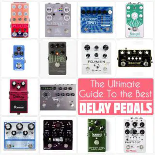
 Delay
Delay
 Dirt
Dirt
 Dynamics
 Filter+EQ
 Lo-fi
Lo-fi
 Modulation
 pitch
pitch
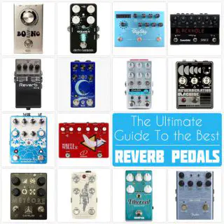
 Reverb
 Synth
Synth
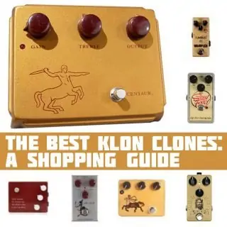
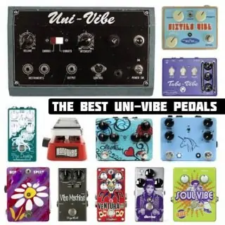
 Shopping Guides
 Stompbox Exhibit